The brand identity proposal which we felt the company identified with best is called Fast Forward.
Dream Production Reloaded
November 11, 2011Following the great client experience we had while developing Iancu’s custom WordPress website, and since we got to see how he painstakingly pursues perfection in his work, there was no doubt in our minds that we found the right brand identity designer to mold our company’s image.
Although we were quite fond of Dream Production’s old logo and the way we managed to create a pseudo-professional visual identity around it during the past 3 years, as the company grew, it became ever more clear that a professionally crafted brand identity could only favor us. It was about time we set our personal feelings aside and let a pro do this job, which we’ll attempt to briefly walk you through.
The brand identity proposal which we felt the company identified with best is called Fast Forward. It makes excellent use of Dream Production’s initial letters, which were already frequently using as DPfor our short alias, by associating them with efficiency and forward thinking.
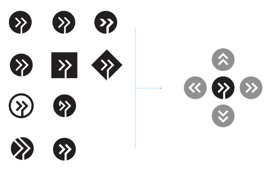
The Dream Production logomark
While shaping the logo, different variations were considered for the central symbol, the final and most optically balanced of which as to symmetry and proportions consists of straight thick lines supported by a circumscribed circle.
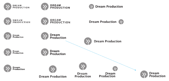
The Dream Production logotype
As far as fonts are concerned, Arial, Georgia, Verdana, and Lucida were used in various proportions in association with the logomark. Lucida Bold was the one preferred in its Title Case format, as the All Caps version appeared to rigid. Other fonts such as Helvetica and Verdana were considered much too common, while Georgia (or any other serif font for that matter) was considered unsuited to match the dynamic and modern nature of the logomark.
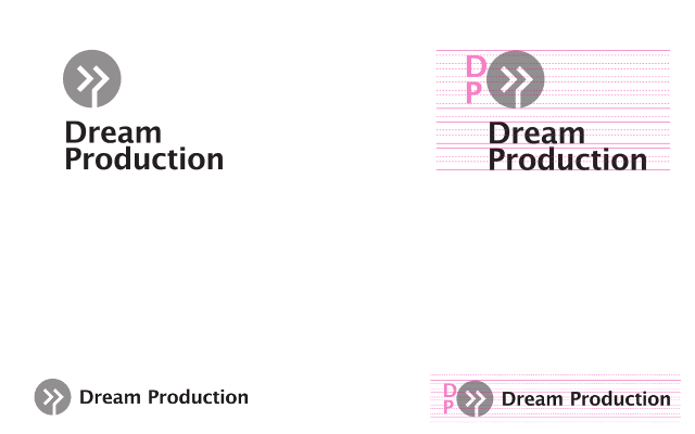
Proportions and safe space
After having developed the logo, its refined version included both an element grid that determines optimal spacing within the logo and safety space guidelines to be applied in order to ensure the desired impact when using the logo in a graphical composition.
Colors
Although the logomark can be used in different color versions and in various environments (on screen, on print, engraved on metal, etc.), a primary color was chosen to be used predominantly in order to ensure visual identity coherence for our company image. Orange was chosen as a highly visible color that highlights the most important design elements, while also being a powerful color that stimulates enthusiasm and creativity.
![]()
Main logo
The main version of the Dream Production logo features the logotype displayed on two lines, highlighting the two initial letters which are also styled in the logomark symbol. Here are the grayscale and the orange version of the logomark.
![]()
Secondary logos
Secondary versions of the logo were developed to be used in case the main version can’t be used in narrow or tall spaces such as web banners.
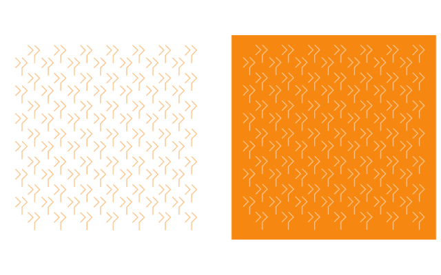
Lines, pattern, textures
The logomark’s central symbol was also used to create patterns, one example of which can be seen on our website background.
Fast Forward
The brand identity Iancu Barb?ras? created for our company couldn’t have turned out any better. It’s fresh, clean, and most importantly it captures the essence of what we believe best defines the approach we have towards our work: efficient forward thinking. Besides visually developing our identity, Iancu also provided valuable advice as to how we should transpose the grid design into a well proportioned and clean website — we can only hope we managed to rise up to his expectations. And, yes, we can’t wait to hear the maestro himself write about his experience with developing our new brand identity.